
A while back, I had a twitter conversation about using network visualization tools online for studying the connections between medieval texts and manuscripts. After this exchange, I figured that others might be interested in seeing some of my work and, more specifically, how I went about it.
My main interests in network visualizations so far have been related to how texts circulate, what texts circulate together, and how this happens across different manuscripts. I’ve done the most work on network visualizations for my forthcoming book, Preaching Apocrypha in Anglo-Saxon England. But I’ve also done some for other projects, and I’m continuing to use this type of inquiry as I consider Old English preaching texts (homilies and sermons) beyond apocrypha. Angie Bennett Segler has done similar work with Piers Plowman and other texts that circulate with that poem, and she’s expanding that work in her Mapping Medieval English Manuscript Networks project.
There are many possibilities for this type of corpus approach. Essentially, it means taking a set of data (sometimes “big data”) and using macroanalysis, or analysis from a bird’s-eye view. This type of approach allows us to see things beyond a single text, or even a single instantiation of a text. Yet it also poses possibilities for navigating between close and distant reading; a single text and its larger contexts; and the various media connections that spiral outward from one focal point to many other relations.
In my book, I address the more discursive and theoretical issues of thinking about transmission networks, as well as my own analytical and interpretive ideas about considering apocrypha and preaching with a network studies approach. But I don’t discuss the behind-the-scenes methodology as much as the payoff. In this post, I want to lay out the process I went through with my data and visualizations of apocrypha and the manuscripts containing them.
First, I’ll note at the start that I’ve used fairly accessible, open tools for my work. For data collection, curation, and organization, I’ve used Google Sheets, mainly because it was an easy platform for sharing my data with others who might want to use it. For network visualizations, I’ve used Palladio, created by Stanford’s Humanities + Design Research Lab. Other tools exist, such as the Gephi interface or coding with JSON. Palladio, however, offers a fairly easy, out-of-the-box tool for users who don’t have coding knowledge or prior experience. (Miriam Posner has written an especially helpful beginner’s tutorial; and Marten Düring has a more intensive lesson for historians.) Palladio is also surprisingly versatile, since there are a number of ways to play with data-sets and to create different types of visualizations.
It’s important to acknowledge that this approach requires a lot of work behind the scenes, with collecting, organizing, editing, and curating data. Before even opening the Palladio website, a data-set needs to be created. For some projects, data may be collected or “scraped” from digital files, repositories, or websites. My own work has largely consisted of manual data collection.
For my projects, my interest has been with specific texts and the manuscripts in which they survive. Here you’ll find the data-set that I used for my book. Fortunately, for Anglo-Saxon manuscripts, I’m able to rely on recent catalogs and resources about manuscripts and their texts. As you can see from my data-set, I wanted to include data about the following:
Text titles for each apocryphon
Modern shelfmark for each manuscript
References to standard catalogs (NRK & ASM)
Date of creation for each manuscript (given as ranges)
Manuscript origin for each manuscript (definite, probable, likely, or possible)
Whether a manuscript is from England or the Continent (Eng/Cont)
Language of the text
Short title reference according to the Dictionary of Old English
So I turned to two of the most authoritative catalogs: Helmut Gneuss and Michael Lapidge’s Anglo-Saxon Manuscripts: A Bibliographical Handlist of Manuscripts and Manuscript Fragments Written or Owned in England up to 1100 (Toronto, 2014); and Orietta Da Rold, Takako Kato, Mary Swan and Elaine Treharne’s The Production and Use of English Manuscripts 1060 to 1220 (a wonderful resource available for free online). Putting all of my data together took a substantial amount of time. Creating data-sets is labor-intensive.
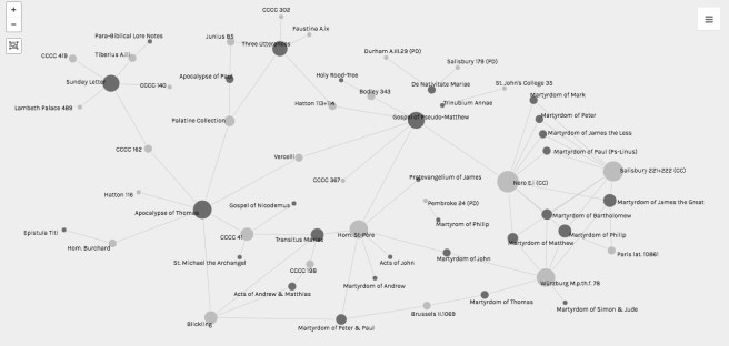
My main goal with visualization was to give a sense of how the various fields of my data-set relate to each other. I wanted to be able to visualize the relationships between texts and manuscripts based on shared content. For example, I wanted to be able to show how different vernacular and Latin versions of the Apocalypse of Thomas survive in seven manuscripts, and how those manuscripts are connected via common content (even beyond this apocalypse, in fact). Conversely, if organized or visualized differently, I wanted to show how the Blickling Book contains Old English versions of four apocryphal texts, and how that collection is related to other manuscripts with parallel content.
To visualize this data-set, I turned to Palladio. To use the data-set in this tool (as in most software), I needed to use a more universal file type, so I downloaded the Google Sheet into the Comma Separated Values (CSV) file format. Once I uploaded the file into Palladio, I was almost ready to go. But, first, needed to verify some bits like special characters, and I needed to tell Palladio to recognize most fields (except dates) as text.
Next, to visualize the relationships I wanted to highlight, I played around with a few options. What I settled on was to tell Palladio to use the “Apocrypha” field (text titles) as the source, and the “Manuscript” field (short shelfmarks) as the target. This made the title of each apocryphal text (e.g. Apocalypse of Thomas) a single node visualized as a dot (in network theory terms, a vertex), every manuscript a single node (again, a dot), and every link between texts and manuscripts a connecting line (in network theory terms, an edge). For clarity of the different types of items in the visualization (text or manuscript), I also experimented with the “highlight” option, to offset the colors of nodes from each other.
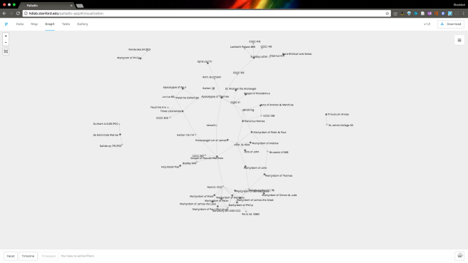
While I’m fairly happy with Palladio overall (it’s the most user-friendly option for network visualizations that I’ve used), I do have a few peeves that are worth mentioning here.Unless the data happens to come out looking just right, visualizations in Palladio need some massaging by users. One issue is that the nodes do not remain in static place unless you physically move them, pinning them by doing so. Below is an example of the network visualized in Palladio without any modifications to make it more legible.
I spent quite a lot of time moving nodes around to optimize how the network was displayed, since there were so many connections and so much complexity.
(I also had a lot of back and forth with the press when we were preparing images of these visualizations for publication, as they had to be revisualized, nodes set back in place, and even touched up in photoshop to make everything legible for printing. Note that the images I’ve included in this post are not the re-visualized, edited, final versions as they’ll appear in the book; instead, I’m posting some versions of visualizations-in-progress.)
Given that the tool is supposed to help sort out that complexity, these issues pose potential frustrations. Nonetheless, like the creation of data-sets, these points remind us that there is a certain amount of humanness needed in digital humanities. This work includes labor that might never be seen or acknowledged by others.
After I had my network pretty well settled in place, I was able to use some of the other options built into Palladio. This was very helpful for how I wanted to show my data in different ways, depending on my focus. For example, in my book, I spend quite a bit of time talking about apocrypha in Latin collections from the Continent.
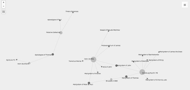
To visualize these connections, I was able to limit the data displayed in Palladio by field. In this case, I used the “facet” option to set up two limitations: one for Language and another for Eng/Cont–so I could limit the visualization to only the Latin texts in manuscripts from the Continent. From another perspective, I was able to use the same “facet” options to limit my visualization to only the Old English texts in manuscripts from England.
Both of these ways of displaying the data play into my overall arguments about how scholars approach the subject of apocrypha, limit our scope, and come to conclusions that often don’t account for the whole of the network. Limiting the data has its benefits in a tool like Palladio. So does being able to switch between facets that might intersect or reveal patterns in the data not otherwise obvious from a catalog or spreadsheet.
Of course, all of these visualizations also require more discursive discussion and analysis. What we do with the data is not only in visualizing but also in synthesizing and interpreting what it means. All of this reminds us that complexity matters when using data.

Depending on how seriously you want to get under the hood on visualizations one thing I’d consider is using the d3 javascript library for future visualization work. I’m trying to remember if it handles csv natively but I know for a fact it handles json — which you could convert your csv file into fairly easy. It’d also potentially give you the option to visualize it in different ways, but requires more work under the hood, so to speak, programatically. It is also web native.